

Best Minimal Launchers for Android come down to four standout options: ap15, KISS, Niagara and Olauncher.
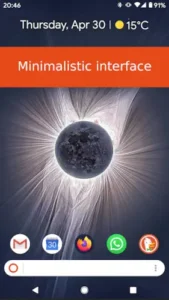

Each takes a different path to the same goal of reducing visual clutter and helping you use your phone more intentionally. Whether you want a text based word cloud, a search first interface, a one handed vertical list or an icon free home screen, one of these launchers fits your habits. Here is how they compare, what each does well and which one might be right for you.
What Are Minimal Launchers and Why Use One?
A minimal launcher replaces your stock Android home screen with something simpler. Fewer icons. Less visual noise. More focus on the apps you actually use. Instead of a grid of colorful icons pulling your attention in a dozen directions, a minimal launcher gives you a quieter interface that asks you to be deliberate about what you open.
The philosophy is straightforward. Most people open their phones dozens of times a day, often without a clear reason. The home screen is designed to encourage that. Bright icons, notification badges and widget grids create a constant pull toward tapping. A minimal launcher removes that pull. It does not block apps. It simply makes opening them a conscious decision rather than a reflex.
Fewer Icons, Less Noise, More Focus
Icon heavy home screens are designed to be visually stimulating. That is the point. Every color, badge and animation is there to catch your eye and prompt a tap. For app developers, that is good business. For users trying to reduce screen time, it is a constant battle.
A minimal launcher flips that dynamic. By removing icons, widgets or both, it removes the visual triggers that lead to impulsive use. You have to type a few letters, scroll to a name or tap a carefully chosen favorite. That small amount of friction is enough for your conscious brain to catch up. Over time, that friction reshapes your habits. The phone becomes a tool again rather than a slot machine.
Who Gets the Most From a Minimal Launcher
Not everyone needs a minimal launcher. If you enjoy the visual richness of a traditional home screen and you are not worried about screen time, there is no reason to switch. But several groups get real value from making the change.
Digital wellbeing enthusiasts who have already tried app timers and grayscale mode will find a minimal launcher adds another layer. It changes the environment itself, not just the rules around it.
Users with aging devices get a performance boost. Minimal launchers use fewer resources, which means faster app launches and smoother navigation on hardware that has seen better days.
People trying to reduce screen time benefit most. The launcher does not just track your usage. It makes the phone less compelling to pick up in the first place.
Privacy conscious users who prefer open source apps will appreciate that KISS and Olauncher are FOSS projects with no data collection. The code is available for anyone to inspect. That is a different level of trust than a commercial launcher provides.

ap15 Launcher – Usage Based Text Home Screen
What ap15 Launcher Does
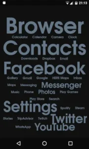
ap15 Launcher turns your home screen into a typographic word cloud. There are no icons. There is no grid. Just a single scrollable list of app names where the apps you use most often appear larger and more prominently. The concept is called usage based typography. The launcher tracks how often you open each app and adjusts its display accordingly.
The result is a home screen that reflects your actual habits. If you use messaging apps constantly, they grow large and bright. If you rarely touch a particular game, it shrinks into the background. Over time, the launcher builds a visual map of how you spend your phone time.
Key Features and Design
ap15 supports both global and per-app text customization. You can change color, size, shadow and font for everything at once or override settings for individual apps. Notification indicators show which apps have pending alerts directly in the text list. You can hide apps you do not want to see, and Pro adds the ability to search for hidden apps.
The design is deliberately minimal. Background patterns in Pro let you add subtle texture, but the focus stays on the text. It is one of the most unconventional launcher designs on Android, and that is the point.
Who ap15 Launcher Is For
This launcher is for users who want their home screen to reflect how they actually use their phone. If you like the idea of a word cloud that evolves with your habits, ap15 delivers. It also suits anyone who enjoys deep text customization. You can tune the appearance of every app name individually if you want.
If you prefer a more conventional layout or you rely heavily on widgets, ap15 may not be the right fit. But for the right user, it is a genuinely unique approach to minimalism.
KISS Launcher – Search First, Launch Fast
What KISS Launcher Does
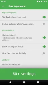
KISS Launcher replaces the home screen with a search bar and a short row of favorites. That is it. To open an app, you tap the search bar and type a few letters. The launcher filters results instantly and learns which apps you open most often, prioritizing them in future searches.
The name says it all. KISS stands for Keep It Simple, Stupid. Everything about this launcher is built around speed. There are no icons to hunt through, no pages to scroll, no folders to maintain. You type, you launch, you move on.
Key Features and Design
KISS Launcher weighs around 250 KB. It has no internet permission, which means it cannot send your data anywhere even if it wanted to. It collects no data and shares none with third parties. The launcher is open source, licensed under GPLv3, with the code available on GitHub.
You can tag apps by context, so typing a tag like “#work” filters results to only show work related apps. History and recent apps are also available for quick re-launching. The design is ultra minimal, with basic light and dark themes and no decorative elements.
Who KISS Launcher Is For
KISS Launcher is for users who want speed and privacy above everything else. If you value a launcher that gets out of your way and lets you find anything in seconds, this is the one. It is also excellent for older or low-spec devices, where its tiny footprint makes a noticeable difference in responsiveness.
If you want visual customization or you rely on seeing icons to remember app names, KISS may feel too austere. But for users who think in search queries rather than icon positions, it is a perfect fit.

Niagara Launcher – One-Handed Minimalism
What Niagara Launcher Does
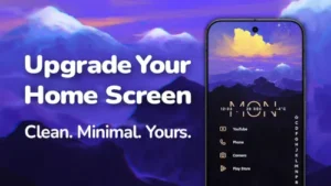
Niagara Launcher puts a vertical list of favorite apps on the left side of the screen and a wave alphabet edge on the right. Swipe along the edge to jump to any letter, then tap the app. Everything is reachable with your thumb. No stretching to the top of a tall phone screen.
The design is optimized for one-handed use, which makes it particularly good on large phones and foldables. The vertical list stays within comfortable reach and the wave alphabet lets you access any app without moving your hand.
Key Features and Design
Niagara integrates notifications directly into the home screen. You can read and reply to messages from selected apps without opening them. The widget stack holds up to four widgets in a compact arrangement, saving space while still providing essential information.
Themes and third party icon packs are supported, so you can customize the look while keeping the list based layout. Material You dynamic theming pulls colors from your wallpaper on supported Android versions. The free version is ad-free. Pro unlocks Theme Studio, expanded widget support, pop-up folders and Usage Breaker for digital wellbeing.
Who Niagara Launcher Is For
Niagara Launcher is for users with tall or folding phones who want a minimalist interface that still feels polished. The one-handed ergonomics are the main draw. If you have ever struggled to reach the top of your screen, Niagara solves that problem.
It also suits users who want minimalism without sacrificing useful features. The integrated notifications, widget stack and theming options make it more feature rich than KISS or Olauncher while still staying clean and focused.

Olauncher – Icon-Free Digital Minimalism
What Olauncher Does
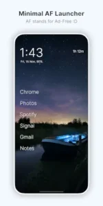
Olauncher strips the home screen down to the absolute minimum. No icons. No widgets. Just a text list of your essential apps, plus the time and date. If you want to open something else, you swipe up to reveal a searchable text list of everything installed.
The design is inspired by dumb phones. It is meant to reduce visual stimulation and make you think before opening an app. The trade-off is obvious. You lose visual richness. What you gain is calm.
Key Features and Design
Olauncher is open source, collects no data and shares nothing with third parties. It has no ads. Basic gestures are supported, including double tap to lock via an optional Accessibility Service that is disabled by default. Optional daily wallpapers add a small amount of visual variety without reintroducing clutter.
You can rename apps to avoid confusion when icons are not visible. You can also hide apps entirely so you must search deliberately to open them. The free version covers the core experience. A separate Pro app adds widgets, app grouping, and notes.
Who Olauncher Is For
Olauncher is for users who want the most radical minimalism available. If you have tried other launchers and still find yourself opening apps mindlessly, Olauncher removes the visual triggers that cause that behavior. It is a digital wellbeing tool disguised as a launcher.
It also suits users focused on screen time reduction. The friction of typing to find an app is enough to make you ask whether you really need to open it. For some people, that pause is transformative.
How to Choose the Best Minimal Launcher for You
| Launcher | Best For | Key Difference |
|---|---|---|
| ap15 | Usage based typography | Word cloud aesthetic that adapts to habits |
| KISS | Speed and privacy | Search first, 250 KB, no internet |
| Niagara | One-handed ergonomics | Vertical list, wave alphabet, notifications |
| Olauncher | Radical minimalism | Text only, no icons at all |
Matching Your Priorities to the Right Launcher
If speed matters most, choose KISS. The search first interface is the fastest way to launch an app on Android. If ergonomics matter most, choose Niagara. The one-handed design is unmatched on tall phones. If you want your home screen to reflect your habits visually, choose ap15. The usage based typography creates a word cloud that evolves with you. If radical minimalism matters most, choose Olauncher. The text only interface removes every visual trigger.
The honest approach is to try one. Download it, use it for a week and see how it feels. All four are free to try, and switching back takes seconds. The right launcher is the one that makes you feel calmer and more in control of your phone. That answer is different for everyone.
Tips for a Calmer, More Focused Phone
Curate your essentials list. Put only daily use apps on your home screen or favorites. Move entertainment and social apps deeper into the drawer or hide them entirely. The fewer apps you see, the fewer impulses you have to fight.
Combine your launcher with app blockers and grayscale mode. The launcher handles the visual environment. App blockers handle hard limits. Grayscale removes the dopamine pull of color. Together they create a phone that is calmer and harder to fall into mindlessly.
Reduce notifications. Even the best launcher cannot help if your phone is buzzing every few minutes. Turn off notifications for anything that is not a direct message from a real person. The quiet will feel strange at first, then liberating.
Test one launcher before switching. Each of these launchers has a learning curve, even if it is short. Give yourself a week to adjust before deciding whether it works for you. Switching too quickly prevents you from experiencing the benefits that only appear after the initial friction fades.
Conclusion
There is no single best minimal launcher for everyone. ap15, KISS, Niagara and Olauncher each take a different approach to the same goal. ap15 gives you a usage-based word cloud that reflects your habits. KISS gives you search first speed and complete privacy. Niagara gives you one-handed ergonomics with useful features. Olauncher gives you radical minimalism with no icons at all.
The right choice depends on what you value most. Speed. Privacy. Ergonomics. Or a home screen that is as quiet as possible. Try one. Give it a week. If it does not fit, try another. All four are free, and the only cost is a few minutes of setup.
If you want to check out other Android launchers and apps beyond minimalism, visit free-apps-android.com personalization for reviews, comparisons and recommendations across every category.
Your home screen should serve you, not distract you. Pick the launcher that helps you do that.
FAQ
Which minimal launcher is best for reducing distractions?
Olauncher is the most aggressive at reducing distraction because it removes icons entirely. ap15 is a close second because the visual hierarchy changes based on usage. Niagara and KISS reduce distraction too, but they keep some visual elements that can still pull attention.
Are these launchers free?
Yes. ap15, KISS, Niagara, and Olauncher are all free to download and use. Niagara and ap15 have optional Pro upgrades for advanced features. KISS and Olauncher are completely free with no paid tiers, aside from a separate Pro app for Olauncher that adds widgets and notes.
Which minimal launcher is most privacy friendly?
KISS and Olauncher are the most privacy friendly. Both are open source, collect no data and share nothing with third parties. KISS goes further by having no internet permission at all.
Can I switch back if I do not like it?
Yes. All four launchers coexist with your stock launcher. If you do not like the experience, you can switch back in your phone’s default apps settings. Nothing is permanent.
Do these launchers work on older Android devices?
Yes. All four work on Android 5.0 or higher, with some requiring newer versions. KISS Launcher is especially good for older devices because of its tiny footprint and minimal resource usage.