

ap15 Launcher turns your Android home screen into a typographic list where app names grow larger the more you use them.
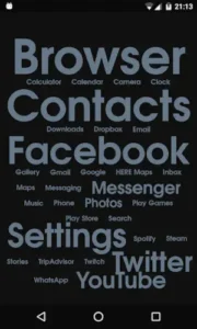

ap15 Launcher is developed by Apseren Industries, this text based launcher has earned a 4.8 star rating from over 16,000 reviews on Google Play and has been downloaded more than 1 million times. The app requires approximately 5 MB of storage, is rated for ages 3 and up and offers a unique “word cloud” aesthetic that replaces icons with dynamic typography.
What Is ap15 Launcher?
ap15 Launcher is a lightweight, text based Android home screen replacement that replaces app icons and grids with a typographic list of app names whose size, color and position adapt to how often you use each app. Instead of swiping through multiple pages of icons, you get a single, scrollable list where your most used apps appear larger and more prominent, while less used apps stay accessible but visually subdued.
The concept is simple but unusual. There are no icons on your home screen. There is no app drawer. There is just a list of words on your chosen background. The apps you open most often grow larger and more colorful. The apps you rarely use shrink and fade. Over time, your home screen becomes a living reflection of your actual phone habits.
Usage Based App Sizing
ap15 tracks how often you open each app and adjusts its display accordingly. Font size increases for frequently used apps. Position changes so the top 30% most used can appear at the top of the list. Color and shadow indicate usage level, creating a visual hierarchy that guides your thumb to what matters most.
The result is a home screen that evolves with you. In the first week, the list may feel random because the launcher has not gathered enough data. After a week or two, the pattern emerges. Your most used apps dominate the top. Rarely used apps sit quietly at the bottom. It is a visual map of your digital habits, and it changes as your habits do.
Single Scrollable List
All installed apps appear in one continuous list. There is no separate app drawer to swipe open. Non favorite apps remain accessible by simply scrolling down. This keeps navigation simple. You unlock your phone, see your list and scroll to what you need. No folders. No pages. No hidden screens.
The single list approach means you never forget where something is. Everything lives in the same place. The only thing that changes is the visual prominence of each app based on your usage. It is a flat structure with a dynamic hierarchy layered on top.
Free vs Pro Version
The free version includes the core usage based list, basic text customization, notification indicators and background color or image options. The Pro upgrade unlocks search including hidden apps, advanced display rules with custom rule creation, a background pattern creator and double tap to lock screen. It is an in-app purchase, not a subscription.
The advanced display rules are where Pro really shines. You can define how apps are shown: “30% most used with larger text size” (the default), “30% most used at the top,” “all the same size,” “all aligned to the right,” or “usage indicated by color.” You can create and save multiple custom rule sets for different contexts.
ap15 Launcher Graphics and Design
ap15 Launcher uses a text only, icon free home screen where app names become the interface. Dynamic typography serves as visual hierarchy, with frequently used apps appearing larger and more colorful. The design is closer to a “word cloud” than a traditional home screen. Optional system bar hiding reduces visual clutter for a more immersive look. Custom backgrounds and patterns let you personalize the aesthetic without reintroducing icons.
Visually, ap15 is one of the more unconventional mainstream launchers. It trades familiar icon grids for a clean, text driven interface that emphasizes usage over visual branding. The result is a home screen that feels like a piece of modern art that happens to also launch your apps.
ap15 Launcher Core Features
ap15 Launcher is not trying to be the most feature packed launcher on Android. It is trying to be the most distinctive one. Here is what it actually does and why each piece matters.
Usage Based App Display
This is the feature that defines ap15 Launcher. Every time you open an app, the launcher quietly logs that action and adjusts how the app appears on your home screen. Font size grows for frequently used apps. Position shifts so the top 30% most used can float to the top of the list. Color and shadow intensity indicate usage level, creating a visual gradient that your thumb reads before your brain does.
The effect is subtle at first. After a week or two, your home screen becomes a visual map of your actual habits. The apps you rely on dominate the top. The ones you barely touch sit quietly at the bottom, still accessible but no longer demanding attention. This is not a static layout you configure once. It is a living interface that changes as your behavior changes.
Single Scrollable List
All installed apps live in one continuous list. No folder hierarchy. No app drawer to swipe open. No hidden pages. You unlock your phone, see the list and scroll to what you need. Non favorite apps remain accessible by simply scrolling down. This flat structure eliminates the “where did I put that app” problem. Everything lives in the same place. The only thing that changes is visual prominence, not location.
Notification Indicators
Notification badges appear directly in the text list, so you can see which apps have pending alerts without opening them. The indicator sits next to the app name, subtly telling you what needs attention. You decide whether to act on it or scroll past. This removes the constant pull of the status bar and keeps the decision inside the launcher layer.
Hide and Search
You can hide apps you never use to declutter the list. Hidden apps disappear from the main view but remain installed and accessible through search. The Pro version unlocks search including hidden apps. This is the escape hatch for apps you need occasionally but do not want cluttering your home screen. A banking app, a work tool, or a utility you touch once a month can be hidden and still launched when required.
System Bar Hiding
The option to hide top and bottom system bars gives you a cleaner, more immersive home screen. The text list floats on your wallpaper or chosen background without the visual noise of battery icons, signal bars and navigation buttons. It is a small change that makes the launcher feel less like a phone interface and more like a canvas. The text becomes the only thing competing for your attention.
Background Customization
Set a solid color or an image as your background. The Pro version adds a background pattern creator, letting you build custom patterns directly inside the launcher. This is where ap15 becomes more than functional. A solid black background with white text feels like a minimalist poster. A photo background with shadowed text feels like a reading app. The aesthetic is yours to define.
Text Customization
Global text settings let you configure color, size, shadow and font for all app names at once. Per-app settings let you override any individual app. Advanced display rules (Pro) let you define how apps are shown based on usage. You can set “30% most used at the top,” “all the same size,” “usage indicated by color” or build your own rule set and save it for later. This is where the launcher stops being a novelty and starts being a tool for people who think carefully about visual hierarchy.
Gestures and Shortcuts (Pro)
Double tap to lock the screen is the headline gesture. It requires the Accessibility permission to work. Once enabled, you can lock your phone without touching the power button. It is a small convenience that becomes habit within a day. The Pro version also includes other gesture based shortcuts that speed up navigation without adding visual clutter.
What Users Say About ap15 Launcher App
What Works
Users consistently praise the unique concept of a text only list with dynamic font sizes as “fantastic,” “clean” and “well implemented”. Frequently used apps become larger and easier to tap, reducing time spent searching. The deep text customization, including global and per-app font, color, size and shadow settings, is frequently highlighted as a standout feature. The launcher feels light and unobtrusive with a minimal resource footprint.
Where The App Could Improve
Common criticisms include bugs and UI glitches. Some users report menus for appearance settings disappearing quickly, making it hard to change colors or advanced rules. Occasional crashes when tweaking advanced rules have been mentioned. Power users miss robust search and advanced gestures unless they upgrade to Pro. A subset of users find it harder to recognize apps without icons, especially for apps with similar names. The app’s data collection and sharing (including location) is more permissive than fully offline minimal launchers, which may deter privacy focused users.
Check out KISS Launcher for a search first minimalist launcher with stronger privacy protections.

ap15 Launcher Tips
Beginner Advice
Let usage data settle for at least a week before judging. This is the single most important tip. In the first few days, the launcher has not gathered enough data to size and position apps meaningfully. The list may feel random. Give it at least a week of regular phone use. After that, the visual hierarchy starts to emerge and the home screen begins to reflect your actual habits.
Curate with hide and per-app styling. Use the hide feature to remove apps you never open. Then use per-app text settings to manually adjust color and size for apps that matter. The automatic system works well over time, but manual adjustments speed up the process for apps you use every day.
Manually adjust color and size for critical apps. Phone, Messages, Camera and Maps should stand out even before usage data fully optimizes them. Give them larger text, brighter colors, or stronger shadows so they are immediately visible and tappable. Your most essential apps should never be buried in the list.
Use notification indicators to decide which apps to open. The in-list badges show you what has pending alerts without requiring you to open each app. Let the indicators guide your attention. If nothing has a badge, you can scroll past without checking.
Start with global text settings, then customize individual apps. Configure the overall look first: font, base size, color, shadow. Get the foundation right. Then override individual apps that need special treatment. Working from global to specific keeps the process manageable.
Try a solid background color first, then images. A solid color makes the text easy to read and helps you evaluate the launcher’s core concept without distractions. Once you are comfortable with the layout, experiment with images and gradients. Solid first, complexity later.
Enable system bar hiding for a cleaner look. Hiding the top and bottom system bars removes visual noise and lets the text list breathe. The change is subtle but makes the launcher feel more intentional and immersive. You can always re-enable them if you miss the battery indicator.
Test the single scrollable list to get comfortable. Spend time scrolling through the list. Get a feel for where apps naturally sit. Within a few days, the positions become familiar and launching apps by scrolling becomes second nature.
Review data safety settings if you are privacy-sensitive. ap15 collects and shares location, app activity and other data types. Data is encrypted in transit but cannot be deleted. If privacy is a priority, review the Data safety section on the Play Store listing before installing. This launcher is not built for privacy first users.
Combine with app blockers for stronger digital wellbeing. ap15 reduces visual clutter on the home screen, but it does not block apps. Pair it with an app blocker if you want hard limits on certain apps. The launcher handles the interface layer. The blocker handles the behavioral layer.
Advanced Strategy
Experiment with advanced rules (Pro) for different workflows. The Pro version unlocks custom display rules. Try “30% most used at the top,” “all the same size” and “usage indicated by color” to see which feels fastest for your workflow. Different rules suit different people. Find yours.
Save multiple rule sets for work, home, and travel. If you use your phone differently in different contexts, create separate rule sets. A work profile might prioritize productivity apps at the top. A travel profile might emphasize maps and messaging. Switching between rule sets changes the visual hierarchy instantly.
Create custom background patterns (Pro). The pattern creator lets you build backgrounds that match your style without leaving the launcher. Subtle patterns can add depth without distracting from the text. This is where ap15 starts to feel like a design tool as much as a launcher.
Use search including hidden apps (Pro). Hiding apps keeps the list clean. Searching hidden apps keeps them accessible. The Pro version unlocks this combination, which is the best of both worlds. Clean home screen, full access when needed.
Configure double-tap to lock for quick screen-off. The double tap gesture requires Accessibility permission but pays off with instant screen-off. No reaching for the power button. Just tap twice on the home screen. It becomes habit within a day.
Adjust per-app text settings for visual hierarchy. Beyond global settings, per-app adjustments let you fine-tune how each app appears. Use this for apps that need to stand out but do not get opened enough to grow automatically. Manual overrides fix the gaps in the automatic system.
Pair ap15 with grayscale mode for calmer use. Grayscale removes color from your screen, reducing visual stimulation. Combined with ap15’s text based interface, the phone becomes even quieter. This pairing is especially effective for users focused on digital wellbeing.
Share your setup with minimalist communities. The minimalist launcher community on Reddit and other platforms shares configurations, rule sets, and background ideas. Sharing your setup and seeing what others do can inspire changes you would not have considered.
Revisit usage data monthly to see how habits change. The launcher’s visual hierarchy reflects your last few weeks of usage. Check it monthly. If an app has grown unexpectedly, that tells you something about how you are spending your time. Use the insight to adjust, or just to notice.
Combine with focus timers for intentional phone use. ap15 changes how your home screen looks. Focus timers change how long you spend on it. Together they create a more intentional phone experience. The launcher handles the visual layer. The timer handles the behavioral layer.
ap15 Launcher Similar Apps
| App | Best for | Key Difference |
|---|---|---|
| ap15 Launcher | Usage based text only home with deep typography customization | Single scrollable list of app names; size and color adapt to usage. Unique “word cloud” aesthetic. |
| KISS Launcher | Search first minimalism, speed, privacy | Search bar plus favorites plus results list. No icons. FOSS and no internet permission. More search centric than usage based. |
| Niagara Launcher | All around minimalism with one handed ergonomics | Vertical list plus wave alphabet. Icons, compact widgets. More visually polished than ap15. |
| Olauncher | Extreme distraction reduction, text-only home | Text list with no icons at all. FOSS and no data collection. More radical than ap15. |
| Nova Launcher | Deep customization, traditional grid | Classic icon grid, dock, multiple pages. Best for power customizers. Not minimal by default. |
ap15 is the best choice for users who want a usage adaptive, text based home screen that visually reflects their habits. If you prefer search first navigation, KISS is better. If you want one handed ergonomics with icons, Niagara wins. If you want maximum minimalism with no data collection, Olauncher is the answer.
Who Is ap15 Launcher For?
ap15 Launcher is for users who want a text only, icon free home screen. If you find icon grids visually overwhelming or you are tired of hunting through pages of similar looking icons, ap15 replaces that with a single scrollable list. The interface is quiet, readable and immediately clear.
Minimalists who want usage based visual hierarchy will appreciate how the launcher adapts to their habits. The apps you use most grow larger. The apps you rarely touch fade into the background. The home screen becomes a living map of your phone behavior rather than a static grid you configured once.
People who enjoy deep text customization will find a lot to work with. Global settings, per-app overrides, advanced display rules and background patterns give you control over every visual detail. You are not just using a launcher. You are designing a typographic interface.
Users who want a “word cloud” aesthetic on their phone will find ap15 delivers exactly that. The home screen looks like a piece of modern art that happens to launch apps. If you want your phone to feel less like a utility and more like a personal design object, this is the launcher for you.
If you want a home screen that reflects how you actually use your phone, ap15 Launcher is worth trying.
Conclusion
ap15 Launcher delivers a text based Android home screen experience that stands out for its usage adaptive typography and deep customization. The apps you use most grow larger. The list stays in one place. The background is yours to design. The interface is quiet, readable and unlike anything else in the launcher space.
The app has limitations. Bugs and UI glitches appear in some reviews. Search and advanced gestures require the Pro upgrade. Learning to navigate without icons takes a few days. The data collection practices are more permissive than privacy first alternatives like KISS or Olauncher.
For users willing to embrace the typographic approach and accept the trade-offs, ap15 offers a launcher experience that feels personal in a way most launchers do not. It does not try to be the fastest or the most private or the most feature complete. It tries to be the most visually distinctive and the most adaptive to your actual habits. And for a specific kind of user, that is exactly what they want.
If you want a home screen that reflects how you actually use your phone, ap15 Launcher is worth downloading.
Your home screen should reflect how you actually use your phone. ap15 makes that happen.
ap15 Launcher FAQ
How do I download ap15 Launcher and is it really free?
ap15 Launcher is free to download from Google Play Store. The free version includes the core usage based list, basic text customization, notification indicators and background color or image options. The Pro upgrade is an in-app purchase that unlocks search including hidden apps, advanced display rules, background pattern creator, and double-tap to lock. There is no subscription.
What if I encounter a problem or need support?
For technical issues, bug reports, or general questions, contact the developer directly at apseren@gmail.com. The developer, Aurélio Santos, is based in Portugal and lists a physical address and privacy policy through the Play Store. You can also report translation issues or suggest improvements via email. For community support, minimalist launcher forums and subreddits may have users who have encountered similar issues.
What makes ap15 Launcher different from other minimalist launchers?
ap15 Launcher is built around a typographic list of app names that adapt to your usage. The apps you open most often appear larger and more colorful. The apps you rarely use shrink and fade. There are no icons, no app drawer and no grid. Everything lives in a single scrollable list where visual hierarchy is determined by your actual habits. This is different from search first launchers like KISS, vertical list launchers like Niagara and text only launchers like Olauncher. Each has its own approach to minimalism. ap15’s approach is usage based typography.
Does ap15 Launcher collect my data?
Yes, and this is important to understand before installing. According to the Google Play data safety section, ap15 Launcher may collect and share data types including location, app activity and other information with third parties. Data is encrypted in transit but cannot be deleted by users. This is more permissive than fully offline launchers like KISS Launcher, which has no internet permission at all. If privacy is a priority, review the Data safety section carefully. ap15 is a customization and visualization tool first and its data practices reflect that.