

Olauncher strips your Android home screen down to the absolute essentials: a text list of apps, the time, the date and nothing else.
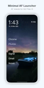

Developed by Digital Minimalism, Olauncher is a free and open source launcher that has earned a 5.0 star rating from over 81,000 reviews on Google Play and has been downloaded more than 1 million times. The app requires just 1.86 MB of storage, is rated for ages 3 and up and is available on Google Play Store.
What Is Olauncher?
Olauncher is a minimalist Android home screen replacement built around one radical idea: remove everything that distracts you. No app icons. No widgets. No ads. Just a clean, text based list of the apps you actually need. The name says it all. “AF” stands for AdFree and the app markets itself as a “minimal AF launcher” for people who want their phone to feel like a tool again, not a slot machine.
The core premise is simple. When you unlock your phone, you see a short text list of your essential apps, plus the time and date. That’s it. To open anything else, you swipe up to reveal a searchable text list of everything installed. This small amount of friction is intentional. It forces you to consciously choose what you’re opening instead of mindlessly tapping a colorful icon .
Text First, Icon Free Home Screen
The home screen is essentially a short list of app names in plain text. You won’t find colorful icons, widget grids or notification dots cluttering the screen . The time and date sit at the top, and an optional status bar shows battery and connectivity info if you want it.
This deliberate “boring” design is the whole point. There’s nothing visually stimulating about a text list. No red notification badges pulling your attention. No bright icons tempting you to tap. Just words on a screen. Users consistently report that this simplicity helps them reduce screen time and break the habit of opening apps without thinking .
App Drawer and Search
Swiping up reveals all your installed apps as a searchable text list. Start typing and the list filters instantly. When your search becomes specific enough to match a single app, it launches automatically. This makes opening even non essential apps faster than scrolling through an icon grid, once you get used to typing instead of tapping.
The search first approach means you never have to hunt for an app buried on page three of your drawer. Just type the first few letters and hit enter. It’s a different interaction model than most people are used to, but it’s surprisingly efficient once it becomes habit.
Free vs Pro Version
The free version is fully functional for core minimalism. You get the text based home screen, the app drawer, gestures, customizations and daily wallpapers. Nothing is locked behind a paywall.
The Pro version, available as a separate paid app, adds a dedicated widgets page, app grouping features, built-in note taking and more wallpaper variety. It’s a one time purchase, not a subscription. If you need widgets (weather, calendar, notes) on your home screen, Pro is the only way to get them without abandoning the minimalist philosophy. If you don’t use widgets, the free version is all you need.
Olauncher Features
Minimalist Homescreen
No app icons, no widgets, no ads on the main screen. Just a short list of app names in plain text, plus time, date and an optional status bar. The screen is so stripped down that it almost feels empty at first. That emptiness is the feature.
App Drawer and Search
Swipe up to see all installed apps as a text list. Type to filter instantly. Apps auto launch when the search becomes unique. The drawer maintains the same text only aesthetic as the home screen, so there’s no jarring visual shift when you go looking for something.
Customizations
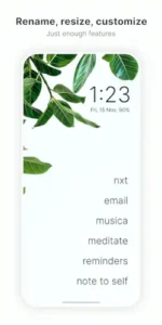
Resize text, rename apps, hide unused apps. Show or hide the status bar. Adjust app text alignment. Choose dark or light themes. Dual apps and work profile support . You can rename “Gmail – Work” and “Gmail – Personal” to avoid confusion, or hide social media apps entirely so you have to search for them deliberately.
Gestures
Double tap to lock the screen. Swipe left or right to open configurable shortcut apps. Swipe down for notifications. These gestures replace the icon taps you’d normally use, giving you quick access to your most used tools without cluttering the home screen.
Wallpapers
Optional daily wallpaper refresh keeps the background interesting despite the minimal UI. You can also set your own wallpaper from the gallery or photos app. Long pressing the daily wallpaper setting applies a pure black background, which saves battery on OLED screens and cranks the minimalism up even further.
Privacy and Licensing
No data collection. No data shared with third parties. FOSS (free and open-source software) under GPLv3 license. The accessibility service, which enables double tap to lock, is optional, disabled by default and doesn’t collect or share any data. For privacy conscious users, Olauncher is about as clean as a launcher gets.
Pro Version Features
Dedicated widgets page. App grouping. Built-in note taking. More wallpaper variety. Extra customization options. These features are for users who want a bit more functionality while staying as close to minimal as possible.
Is OLauncher Better Than Nova Launcher?
The honest answer: they are not competing for the same person. Asking if Olauncher is better than Nova is like asking if a bicycle is better than a pickup truck. Both get you somewhere, but the experience and the purpose are completely different.
Nova Launcher is a customization powerhouse. It has been the reference point for Android launchers for over a decade. You get gesture assignments, custom icon packs, scrollable docks, grid presets, unread badges, hidden apps and full backup and restore. The free tier already covers most people’s needs and Prime unlocks the rest for a one time fee. If you want to tweak every pixel and have your home screen look exactly how you imagine it, Nova is still the tool.
But Nova has changed. The January 2026 acquisition by Instabridge introduced ads in the free version, tracking code and a shift to an annual subscription model for new users. Legacy Prime purchasers kept their ad-free access, but new users face a different deal than the one that made Nova beloved. One long time user who used Nova for 14 years described it as “getting murdered by Play store reviews (and rightly so) due to enshitification after being bought out”.
Olauncher is the opposite philosophy. It is open source under GPLv3, ships zero ads, gathers no data and weighs just 3 MB. The home screen is a text list of up to eight apps. No icons. No widgets. No folders. The app drawer is a searchable text list of everything else .
So which is better? If you use widgets, need folders or enjoy spending time customizing, Nova is the better tool for you. If you want a phone that stops pulling at your attention and you are willing to trade customization for calm, Olauncher wins. The trade-off is real: Olauncher will annoy you within a day if you rely on a calendar widget. But for people trying to break the habit of mindlessly opening apps, that “annoyance” is the feature.
How to Reduce Phone Screen Time with a Minimalist Launcher
The mechanism is simpler than most people expect. A minimalist launcher does not block apps. It removes the visual triggers that make you open them without thinking.
Icons are the problem. Colorful app icons, notification badges and widget grids are designed to pull your eye and prompt a tap. When you unlock your phone and see a red badge on Instagram, your thumb moves before your brain decides. A text only launcher removes that visual trigger. The home screen becomes a list of words. There is nothing to pull at you.
Friction replaces impulse. To open a non-essential app in Olauncher, you swipe up, type a few letters and tap the result. That is two or three extra seconds. That small delay is enough for your conscious brain to catch up. One writer described it this way: “Adding more steps may sound unintuitive, but it makes every action feel intentional. I have to navigate a little more to reach an app like Reddit or Instagram. There were days when I’d forget to check Reddit because it felt so inaccessible compared to my productivity apps”.
Hiding apps works better than deleting them. Olauncher lets you hide apps from the drawer entirely. They are still installed and accessible, but you have to go through settings to bring them back. This is more practical than uninstalling, because you do not lose your data or have to reinstall when you want to check something. The barrier is just high enough to make you pause.
Screen time visibility helps. Olauncher can display your daily screen time right on the home screen. Seeing that number every time you unlock your phone is a quiet accountability nudge. One user reported that after installing Olauncher, their “Digital Wellbeing and battery usage stats exposed how my productivity apps took up a larger chunk of my screen time”.
Combine it with other tools for stronger effect. Olauncher removes visual temptation. Pair it with grayscale mode to reduce the dopamine pull of color. Add an app blocker if you need hard limits. The launcher handles the moment of unlock. The other tools handle the moments after.
Best Android Launcher for Digital Wellness
If digital wellness is the goal, the field narrows quickly. Here are the launchers that actually serve that purpose, ranked by how aggressively they prioritize wellbeing over features.
Olauncher is the most radical option. Text only, no icons, no widgets, open source, zero ads, no data collection, 3 MB. It is the closest thing to turning your smartphone into a dumb phone without buying new hardware. The trade-off is real: no widgets, no folders and a learning curve for anyone used to icon grids.
KISS Launcher is the search-first alternative. Also free, open source, and very lightweight. Instead of a text list of apps, it puts a search bar front and center. You type what you want and launch it. It is minimal without being quite as austere as Olauncher.
Niagara Launcher is the middle ground. It keeps small icons but arranges them in a clean vertical list with integrated notifications. It is more polished than Olauncher and more usable for people who still want some visual structure, but it is not as aggressively minimal. The premium features require a subscription .
Minimalist Phone is the feature rich option. It combines a dumb phone interface with an app blocker, notification filter, grayscale mode and blocking schedules. It is less about stripping the interface and more about actively managing your usage. If you want a launcher that does the blocking for you, this is the one.
Indistract is the bare-bones productivity option. It shows only the date, time, screen time, battery and weather, with just two apps on the home screen: Calls and Tasks. The free version is fully functional and Pro adds themes and fonts.
The bottom line: If you want the most aggressive digital wellness tool, Olauncher is the answer. It removes the visual triggers and adds friction to every app launch. If you want a gentler transition, Niagara or Minimalist Phone offer more features while still prioritizing focus. The best launcher for digital wellness is the one you will actually stick with and for many people, that means starting somewhere between “icon grid” and “text only list.”
Olauncher Graphics and Design
Olauncher uses a text first, icon free UI with plain text app names. The typography is clean, with options for light and dark themes, adjustable text size and alignment choices. Optional daily wallpapers add visual interest without cluttering the interface. Long pressing the daily wallpaper setting applies a pitch black background for OLED battery savings.
There are no animations, theme packs or decorative elements. The design is deliberately “boring” in the best possible way. It reduces visual stimulation and impulse tapping. Visually, Olauncher is one of the most stripped down launchers available, closer to a “dumb phone” home screen than anything else on Android.
What Users Say About Olauncher App
What Works
Users consistently praise Olauncher for effectively reducing screen time. Many report opening apps less mindlessly, reading more and feeling less pulled into social media because there are no colorful icons or endless widget rows. The text based design is described as “vanilla,” “elegant,” and “nice” compared to icon heavy launchers.
The privacy friendly and open source nature is frequently highlighted as a major positive. Users appreciate that the app collects no data and contains no ads. It feels fast and unobtrusive, with basic gestures working well once configured. The app is lightweight and stable .
Where The App Could Improve
Common criticisms include missing widgets in the free version. Weather, calendar and other widgets are only available in Olauncher Pro or via workarounds. Some reviewers note confusion with duplicate app names or similar sounding apps when icons are hidden. Renaming apps helps, but requires manual setup .
Compared to Nova, Lawnchair or even Niagara, Olauncher offers fewer gestures, no icon packs, and limited deep UI tweaks by design. There’s no letter scroll bar in the app drawer, which would make navigation easier for users with many apps. Some users wish there was an option to disable automatically opening an app when text searching, because the search box doubles as a Google search trigger.
Check out Niagara Launcher for a minimalist launcher that keeps icons but uses a vertical list, or explore the full collection of Android apps to find your next productivity tool.
Olauncher Tips
Getting started with Olauncher is straightforward, but a few smart choices early on will make the transition from icon grid to text list much smoother. Here is what to focus on first.
Beginner Advice
Curate your “essential” app list with only daily apps. This is the first and most important step. Open Olauncher and decide which apps deserve a spot on the home screen. Phone, Messages, Camera, Maps and one productivity app is a good starting point. Everything else goes into the drawer. The fewer apps on your home screen, the less temptation to tap mindlessly.
Rename confusing apps to distinguish similar names. Without icons, “Gmail” and “Gmail Work” look identical in a text list. Use the rename feature to clarify. “Mail – Personal” and “Mail – Work” are instantly distinguishable. This small step saves confusion every time you open the drawer.
Hide your biggest distractions so you must search for them. Social media, games, shopping apps. Hide them. When you want to open Instagram, you have to swipe up and type. That extra friction is the whole point. It gives you a moment to ask yourself if you actually want to open it or if you are just reaching for the habit.
Enable double tap to lock for quick screen-off. The double tap gesture is the fastest way to lock your screen. It uses an optional accessibility service that is disabled by default. Enable it, and you can put your phone down with a single motion instead of reaching for the power button.
Assign your two most used apps to left and right swipes. Swipe left and swipe right can each open a configurable shortcut app. Assign your two most essential apps (Messages and Camera, for example) so they are always one swipe away. This gives you quick access without cluttering the home screen.
Hide the status bar if constant indicators cause anxiety. The status bar shows battery, signal and notification dots. If those indicators pull your attention or cause low grade anxiety, hide the status bar on the home screen. You can still check them by pulling down the notification shade when you need to.
Start with light theme, switch to dark if preferred. The default light theme is clean and readable. If you use your phone at night or prefer darker interfaces, switch to the dark theme in settings. Both themes maintain the text only aesthetic.
Test the app drawer search to get comfortable. The search-first approach is different from scrolling an icon grid. Spend a few minutes typing app names and watching the list filter. Once you get used to it, opening non essential apps becomes faster than hunting through pages of icons.
Use daily wallpapers to keep the background fresh. The optional daily wallpaper feature gives you a new background each day. It adds visual interest without cluttering the interface. If you prefer something more personal, set your own wallpaper from the gallery.
Combine with app blockers for stronger effect. Olauncher removes the visual temptation of icons. App blockers remove access entirely. Pair the two for a stronger digital minimalism setup. When a distracting app is both hidden and blocked, you stop reaching for it altogether.
Advanced Strategy
Move social media and games into the drawer or hide them. If you want them available but not tempting, move them into the drawer. If you want them gone entirely, hide them. You can always unhide them when you actually want to use them. The friction is the feature.
Pair Olauncher with focus timers and grayscale modes. Grayscale mode removes color from your screen, making everything less stimulating. Combine it with a focus timer for deep work sessions. Olauncher and grayscale together create a phone that feels like a tool, not a toy.
Use work profile support for separating work and personal apps. If your phone has a work profile, Olauncher supports it. Keep work apps separate from personal apps. When you are off the clock, you do not see work notifications cluttering your personal space.
Consider Pro version if you need widgets and notes. The free version has no widgets. If you rely on weather, calendar, or notes on your home screen, Olauncher Pro adds a dedicated widgets page and built-in note taking while keeping the minimalist philosophy intact. It is a one time purchase, not a subscription.
Rename apps for clarity if you have duplicates. This applies beyond just work and personal. If you have multiple messaging apps or multiple browsers, rename them so you know which is which at a glance. “Chrome” and “Firefox” are clear, but “Browser 1” and “Browser 2” are not.
Adjust text size and alignment for comfort. The default text size works for most people, but you can make it larger or smaller. You can also adjust alignment. Find the setting that feels most comfortable for your eyes and reading style.
Use shortcuts for frequently used tools. Olauncher supports shortcut gestures. Assign your most used tools to specific swipes. If you check your calendar every morning, assign it to a swipe. If you use a notes app constantly, make it easily accessible.
Experiment with different wallpapers for variety. The daily wallpaper feature keeps things fresh. If you want more control, set a rotation of your own photos. A rotating wallpaper keeps the minimal interface from feeling monotonous.
Share your setup with digital minimalism communities. The r/digitalminimalism and r/Olauncher communities on Reddit are active with users sharing their setups, tips, and app lists. Sharing your setup and seeing what others do can inspire new ideas and keep you motivated.
Combine with screen time tools for maximum effect. Olauncher reduces temptation. Screen time tools track and limit usage. Together, they create accountability. If you find yourself still spending too much time on hidden apps, use a screen time tool to set hard limits.
Olauncher Similar Apps
Olauncher sits in the minimalist launcher niche, but several alternatives offer different takes on the same idea. Here is how it compares.
| App | Best for | Key Difference |
|---|---|---|
| Olauncher | Users who want an icon free, text only home screen | Most radically minimal. No icons at all. Free core features. |
| Niagara Launcher | Minimalists who still want icons and a polished experience | Vertical list with small icons. More features, subscription for premium. |
| KISS Launcher | Keyboard driven minimalists who want search-first launching | Very lightweight and fast. Search bar first. Open source. |
| Minimalist Phone Launcher | iOS users seeking a dumb phone experience | iOS only counterpart. Similar concept, different platform. |
| Ratio / Escape Launcher | Users who want ultra-clean interfaces with subtle visuals | More visual minimalist than text only. Less known than Olauncher. |
Olauncher is the most radically minimal option on this list. If you want no icons at all and a text only interface, it is the clear choice. If you want minimalism but still prefer seeing icons, Niagara Launcher is the better fit. If you want search first launching without the text only constraint, KISS Launcher is worth a look.
Who Is Olauncher For?
Olauncher is for users who want to reduce screen time and distraction. If you have ever unlocked your phone to check one thing and looked up twenty minutes later wondering how you got there, Olauncher is built for you. The text only home screen removes the visual triggers that lead to mindless tapping.
Digital minimalism enthusiasts who want a dumb phone feel will appreciate Olauncher’s approach. It does not try to be a feature rich launcher. It tries to make your phone boring. And for people who want to use their phone as a tool rather than a source of endless stimulation, boring is exactly what they need.
Privacy conscious users who prefer open source apps will find Olauncher appealing. It collects no data, shares no data, and is licensed under GPLv3. The accessibility service is optional and disabled by default. For users who care about what their apps are doing, Olauncher is transparent and clean.
People who want a simple, text based launcher without clutter will feel at home immediately. No widgets to configure. No icon packs to download. No themes to customize endlessly. Just a list of apps and a search bar. The simplicity is the feature.
If you are ready to make your phone less interesting on purpose, Olauncher is worth trying.
Conclusion
Olauncher delivers a minimalist launcher experience that stands out for its radical simplicity. The text only home screen removes visual clutter and reduces mindless tapping. The app drawer search keeps everything accessible without overwhelming you. The gestures give you quick access to your most used tools. The privacy first design means no data collection and no ads.
The app has limitations. The free version has no widgets, which may be a dealbreaker for some users. The text only interface can confuse when apps have similar names. The customization options are limited compared to launchers like Nova or Niagara. There is a learning curve for users who are used to icon grids.
For users willing to embrace the minimalist philosophy and accept that fewer features means fewer distractions, Olauncher offers a compelling experience. It does not try to be the most customizable launcher. It tries to be the least distracting. And for millions of users, that is exactly what they need.
If you want your phone to feel like a tool instead of a slot machine, Olauncher is worth downloading.
Your phone should be a tool, not a slot machine.
Frequently Asked Questions
How do I download Olauncher and is it really free?
Olauncher is completely free to download and use. You download Olauncher from the Official Google Play Store. The app requires just 3 MB of storage space and is rated for ages 3 and up. While the core launcher is free with no ads and no data collection, a separate paid app called Olauncher Pro is available for users who want widgets, app grouping, note taking and more wallpapers. The free version is fully functional for anyone who wants the minimalist experience without spending a cent.
Where can I find guides, tips and community resources?
The official Olauncher website is the best starting point for information and updates. The app has an active community on Olauncher Reddit where users share setups, tips, and customization ideas. The GitHub repository hosts the open source code and issue tracker. For digital minimalism discussions and inspiration, the r/digitalminimalism community is a great resource. YouTube also has setup videos and walkthroughs.
What if I encounter a problem or need support?
For technical issues, bug reports, or general questions, contact the developer directly at thetanuj1@gmail.com. The developer is responsive and regularly updates the app based on user feedback. You can also check the GitHub repository for known issues and updates. For community support, the r/Olauncher subreddit is active with users helping each other troubleshoot problems and share solutions.
What is the difference between Olauncher and Olauncher Pro?
Olauncher is the free, minimalist launcher with a text only home screen, app drawer search, gestures, customization options and daily wallpapers. Olauncher Pro is a separate paid app that adds a dedicated widgets page, app grouping features, built-in note taking and more wallpaper variety. The Pro version is for users who want a bit more functionality while staying minimal. It is a one time purchase, not a subscription. If you do not use widgets, the free version covers everything you need.
Can Olauncher help me reduce my screen time?
Yes. That is exactly what it is designed for. The text only home screen removes the colorful icons and notification badges that trigger mindless tapping. Users consistently report opening apps less impulsively, reading more and feeling less pulled into social media. The small amount of friction from searching for apps instead of tapping icons gives you a moment to ask yourself whether you actually want to open something. Combined with app blockers and grayscale mode, Olauncher can be a powerful tool for digital minimalism.